
T-Mobile & MetroPCS App Concept
Reimagining the mobile home screen experience
THE BRIEF
This project was geared towards refreshing UX, UI and visual design of metroPCS’s preloaded app, MetroZONE. With the potential of positive reception from focus groups, our lifestyle app had the chance of also being preloaded on T-Mobile devices. I was the sole designer of the redesign, which involved reviving old and current content, creating new features, and overhauling settings to address undesired functionality the app had in the past. In addition, this was done in English and in Spanish in a week. I went out to work with T-Mobile’s primary product owner for the app and did extensive user testing in Seattle, where she was extremely receptive to my designs and collaborative, quick-witted nature.
Mobile Posse has since been acquired by Digital Turbine, which still aims to serve content and personalized ads to mobile devices.
I traveled out to Seattle to conduct usability testing on T-Mobile’s preloaded app, which main functionality was to provide content and deliver different times of ads to increase revenue for my company and T-Mobile. The main goal of the of the usability testing was to gauge users on updated visual styling/UI, finding out what content and ads were most relevant and interesting to users, and seeing how users reacted to the delivery method of the app’s content, which primarily was mobile home screen delivery– a webpage, or rich content card, would appear on a users screen upon unlock of their mobile phone if they had opted into receiving these deliveries via the pre-loaded app).
Usability Testing for T-Mobile App
Main usability testing objectives
Opinions on updated visual styling & UI
Most relevant / favorite content
Best form of delivery
Personalization / average user’s knowledge of settings
Research & UX Planning
The main objective of T-Mobile’s pre-loaded app—among many other telecom companies such as Cricket Wireless and MetroPCS—was to serve users with personalized content on their mobile phones, while also monetizing these delivery experiences.
I took note of Google Discovery when it first launched in 2014, where bite-sized bits of information were delivered through advanced schemas to personalize content and target advertising. As the lead designer, I wanted to ensure that users understood the functionality and received content contextually relevant to them. Based deeply in quantitative and qualitative analytics, Mobile Posse (now Digital Turbine) could ultimately help users discover content interesting to them while still producing revenue for Telecom companies and displaying tailored ads to all users.


User personas and customer journeys assisted with creating apps that in turn were desirable to our target audiences.
I created user personas and used data from Google Analytics to create captivating experiences best suited to the audience. I also worked with and managed third-parties who provided the APIs to make these mobile delivery experiences possible.
Wireframes & Mobile Home Screen Card Content
TRENDING PHOTOS
This feature had existed in the past, but was overhauled due to its lack of CTR. After examining the user base, I connected with Imgur and was able to use their API to create a fresh photo-feed experience. My user research, comparative analysis, personas, customer journey maps, and wireframes were the foundation of this successful feature. I did all of the visual and UI design for this, primarily for Android phones, where my responsive web design knowledge was critical to a consistent experience across devices for all users.
Wireframe examples of Trending Photos being delivered to a user’s mobile home screen. We integrated native app capabilities to make the experience cohesive and seamless between home screen delivered content and within the pre-loaded native app.


Native gestures were introduced to the homescreen delivery experience, which bridged the gap between the responsive web designs (home screen rich messages) and the native app experience. This was also a time where native advertising was on the rise, circa 2015. Classic banner and native digital advertising was applied across all features. I worked closely with the third party ad provider Outbrain (at the time Taboola) to ensure the native ads matched contextually and visually.
HOROSCOPES
After a major revenue loss, I collaborated with engineers to resurface old APIs in order to produce new content. I made wireframes, creating several variant designs and conducted A/B testing to see which design was the champion with best UX functionally, most delightful UI, favored visual styling, and best general navigation/information architecture. This feature was also personalized to deliver correct contextual information based on the user. Redesigning settings and preferences were crucial to improve the experience. Below are wireframes and a few variants of UI design. These different UI/visual treatments were tested via Google Tag Manager (GTM), where I could review which designs resonated with users most.


Usability Testing the Prototype
Below are screenshots and insights from the T-Mobile App Prototype. I worked closely with the Product Manager at T-Mobile, having her sit in on usability sessions. This fostered collaboration between the client and company and also provided valuable information on visual, UI and UX design.
I was quick on my feet, making any necessary changes to the prototype between our 10-15 downtime between test participants. This was also done in English and Spanish since about a third of our test participants were Spanish speaking only to accurately reflect the demographic research we had done before recruiting.
Note: This prototype is meant to simulate an in-app experience and home screen delivery of rich content. You may tab through pages by using your keyboard arrows or tap on the McDonald’s 320x50 banner add at the bottom of the app homepage to trigger the mock home screen delivery experience. Overall, users preferred the new design to the old pre-loaded app and found the settings much more accessible and understandable.

T-Mobile branding was not a major factor in this prototype. One of the primary objectives was to see how easily switching from English to Spanish was for users, since over 33% of users were Spanish speaking only.
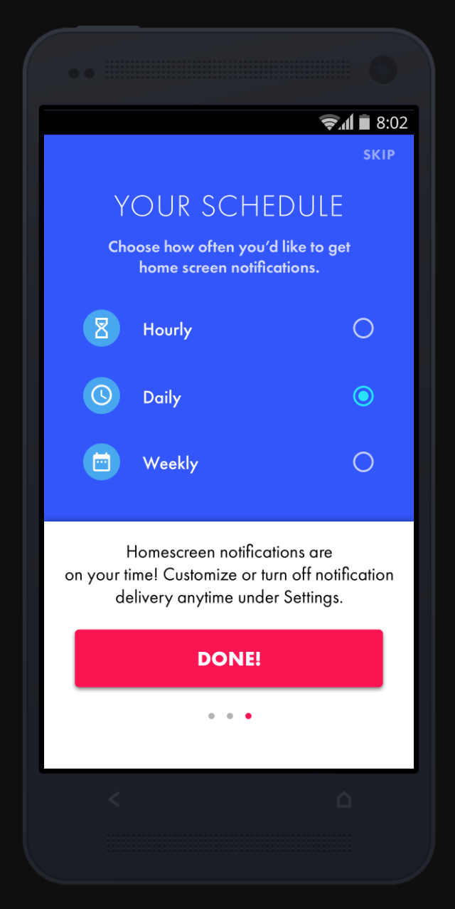
This design specifically speaks to learning how often users would like content delivered. This was a client design, and helped educate client and company that more thought and clarity needed to be put into delivery settings.
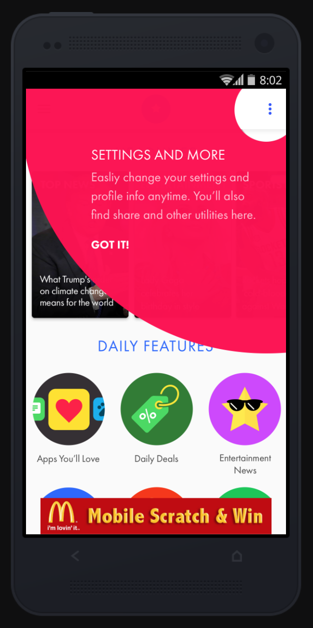
Onboarding was necessary and was found very helpful by most all participants. I also used common Material Design Patterns at the time (circa 2016) since the app was only available to Android users.
A large part of the redesign was to use common Material Design pattern practices and to make settings much more accessible for users.

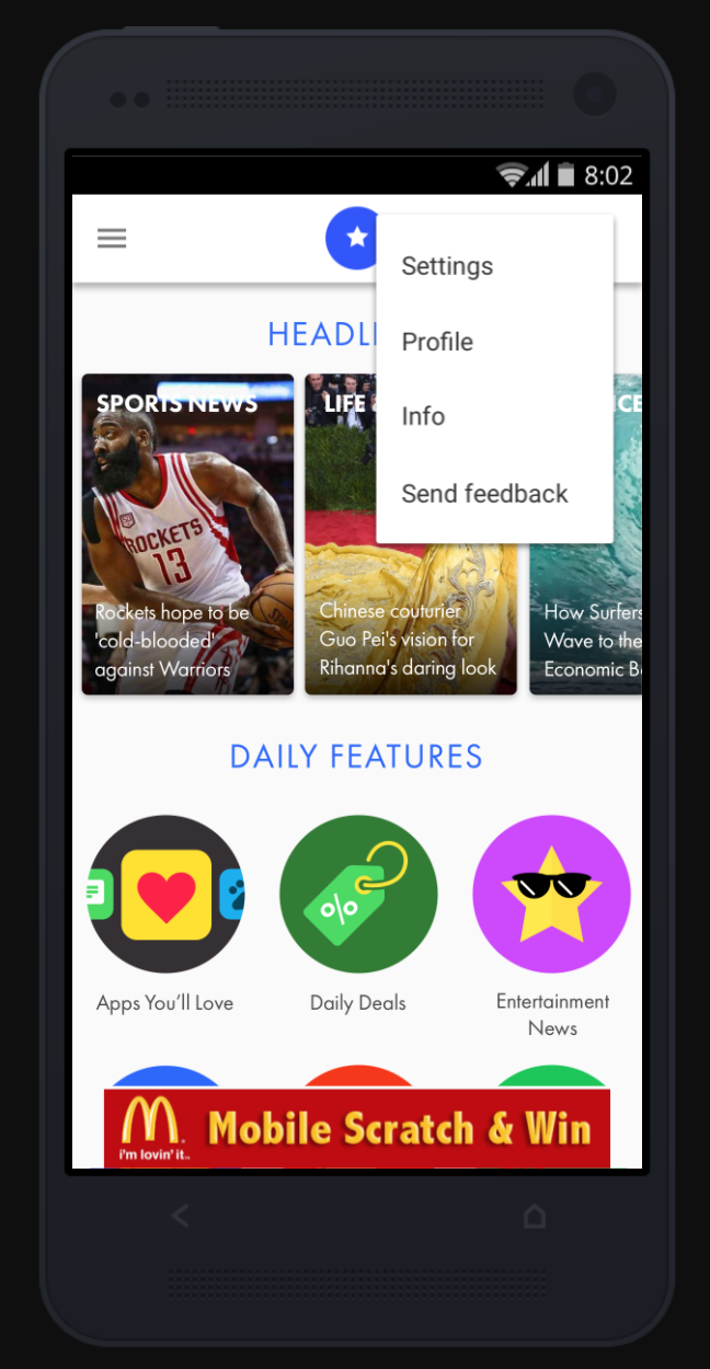
Settings were easily understood by all usability participants. They appreciated the description of the features within the settings, helping them customize their experience without being overloaded by mystery content.

The addition of a global hamburger menu made it easier for users to navigate through the app (whether within native or web delivery experience).

Fortune Cookie is an example of one of the home screen delivered experiences, accompanied by native advertising from Outbrain. This "daily delivered feature" performed the best with a 14% CTR.

By geofencing and location permissions granted by users, we were able to deliver contextually relevant information daily.
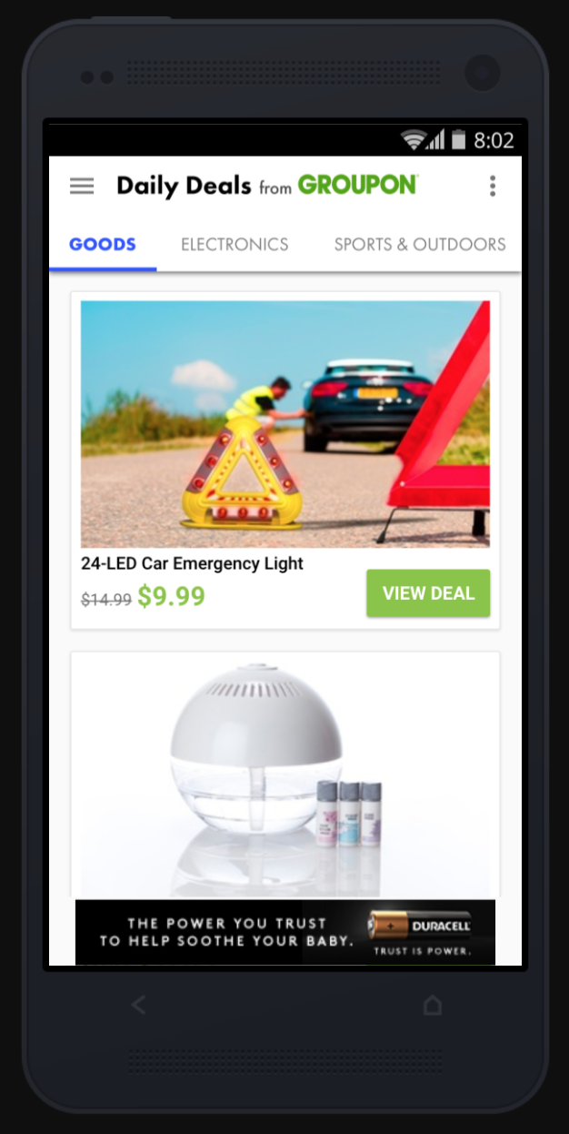
Daily Features included a range of content, from local gas prices to Groupon deals in a user's area. The main goal was to allow users to choose what content was delivered to them without having to open the app and making it as personalized as possible while dealing with technical limitations. Many of the Daily Features revolved around location-based personalized experiences.