FAFSA | Federal Application for Student Aid
FJORD Accenture Federal Services
FAFSA Redesign
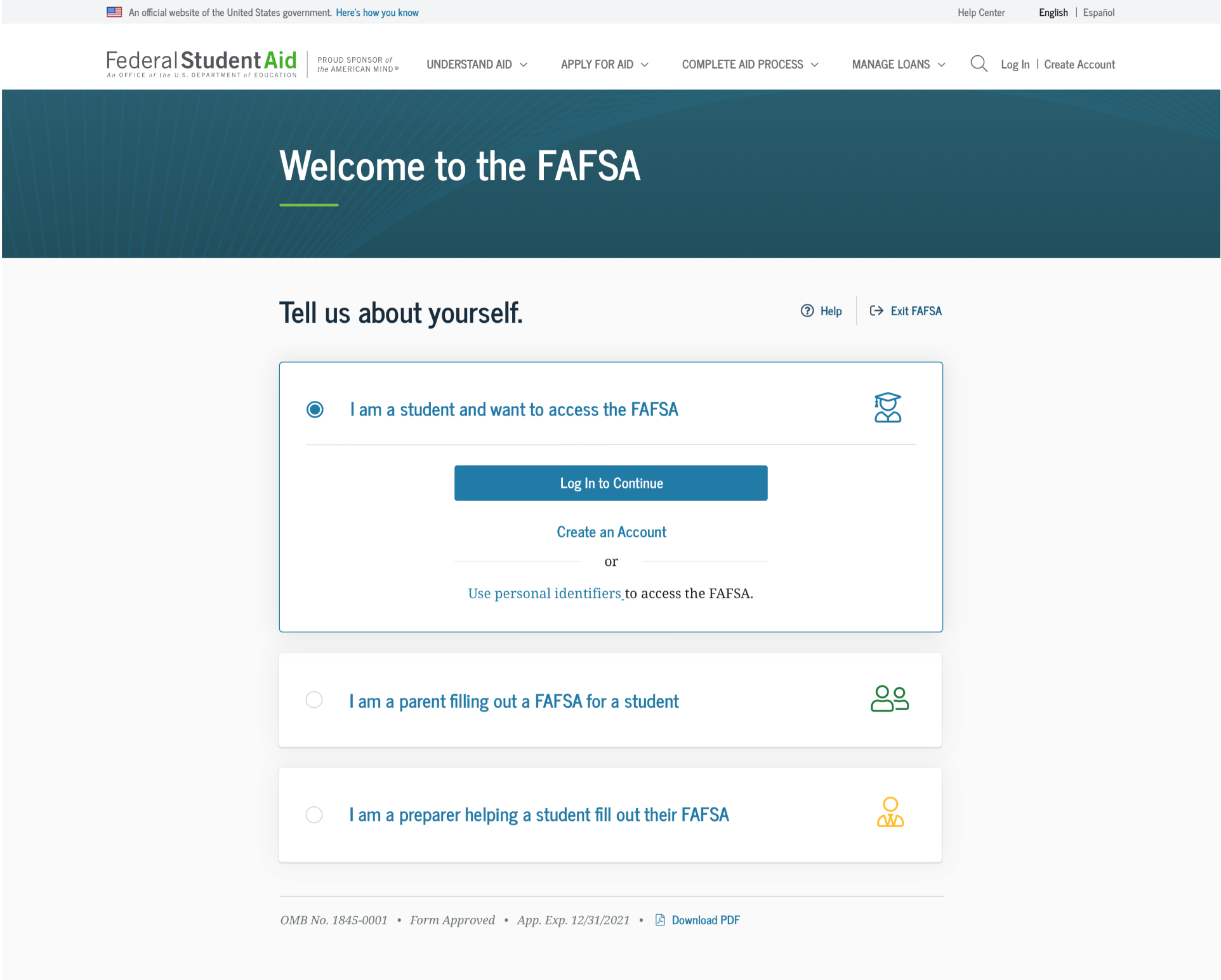
FAFSA’s experience was visually outdated and had some confusing processes. The 200+ question form highly focused on financials is complex and needed major UX reengineering. I led a team that revamped the experience visually and also improved UX through user testing and several collaboration sessions with our clients, FSA.
You can view the prototype here (password: nextg3n) or visit studentaid.gov to see the new experience in production.
User Research
Before redesigning, interviews were conducted with students, parents, school admins and the client to best define the core issues of the form.
User Flows
My large-scale print materials helped foster discussions and engagement with clients to achieve a better solution.
Users were confused with roles to choose when filing out the form. Here is one example of a user flow I printed out for clients and finally determined that the roles needed to be more separated. The final solution was also complimentary with the app that I redesigned, bringing cohesion to all digital channels.
Usability Testing
Extensive research was done on new UI and UX, and also case studies by interviewing students and parents at local high schools in Virginia. Pain points were clear and tackled with design improvements. These adjustments were usability tested, including A/B tests and blind tests. Testers included students that had recently filled out the FAFSA, parents and college students.
Research was conducted pre-redesign to see how schools were helping students and parents. We used this information to inform design updates, where language played a key role in helping guide a specific type of user through the form.
Users were hesitant to use the IRS Data Retrieval Tool, but through language adaptation, strategic UI updates and iconography, users were more willing to use the IRS tool to obtain financial information, which accelerates the completion of the FAFSA form process by 20%.
Final Design Solution Examples
password: nextg3n


